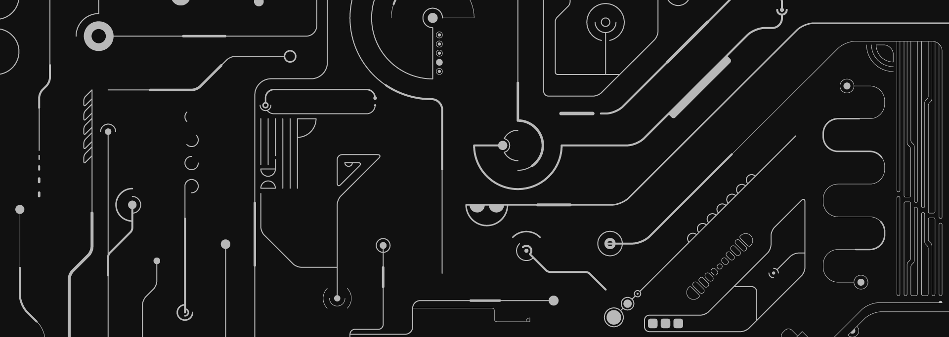
Obviously, as you all have seen lately, we are witnessing some kind of trend forming called Dark UI. More websites and apps are racing to offer a darker version as well. Since Apple introduced its own dark mode on the latest macOS Mojave, more and more software developer companies update their apps with new dark layouts and try to align themselves with this new movement.
The people from Observer.com approached me and asked my opinion on the matter, so this led me to the point of analyzing it in more detail.
Is Dark Mode trend seen as an obstacle by UI designers?
Can they convey the same emotions, actions, and messages with black and gray-dominant layouts?
When designers are searching for a solution to build the best product, website, app… they should not be guided based on personal preference. If the solution requires a darker theme based on their research and empathizing with their users, they should be able to work with the same ease, regardless of the color scheme.
Dark Modeshouldn’t be an obstacle when building something for the user. There are isolated cases though, where designers are more in their comfort zone using lighter color schemes, but this might be only because of their experience in building products that way.
Certainly, with the help of colors we can convey all kinds of emotions and because of this, one might think that gray and black themed interfaces can only cover specific emotions or actions. The truth is that black is an achromatic color, meaning it has no hue value. Black has been the symbolic color of solemnity and authority, but also luxury and elegance. Having no hue is a positive thing in our case because you can pair it with almost every color, thus you can express all kinds of emotions and feelings by finding the correct mix.
If there are concerns, do they outweigh the positives that the trend promises, like relief from eye strain and power conservation (with OLED screens)?
As it is a pretty new trend in the digital space, more or less like 3–5 years have passed since these new types of darker themed interfaces started to appear. There has been some research done on this and few of the main results are exactly the relief from eye strain and power conservation, better known as saving up electricity. But I might also add a few more positives to this.
- One is the optimal legibility in a dark environment. The white text on a black background is also known as, negative text.
- Some medical conditions (e.g. photophobia) are less aggravated by dark backgrounds.
- It also helps in hiding defective pixels that are permanently dark, cracks or scratches on the screen are less likely to be noticed and can cause less confusion and longer usage of the device without needing a repair or any replacements.
- Eye fatigue from video glare and flicker problems are reduced by darker backgrounds.
There might be some concerns as well, but they are really just a few in number and occur in some isolated cases like:
- having a reflective display when the environment is too bright;
- the font used is really small or thin and requires a lot of effort to be read.
These concerns definitely do not outweigh the positives at this time, but no one knows what can happen in the future…
Why do we think that UI has predominantly been white and bright? Is it just copying the traditional magazine layouts that we’ve always known?
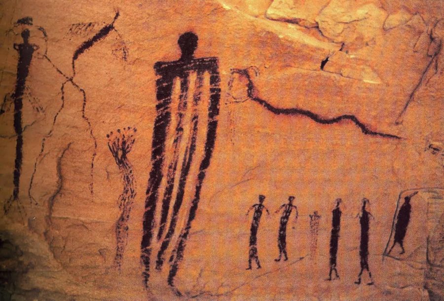
Black was one of the first colors used by artists in neolithic cave paintings. It lived on throughout history and was used in the print industry for centuries as the text was being printed with black ink on white paper for the optimal contrast.
Having newspapers, magazines, and books as a guideline, this was reproduced in digital format as well because it’s what the customers were already used to.
Contrary to this idea when the first digital user interfaces were created, think back to the first computer operating systems that were built like UNIX or MS-DOS, they were dark themed.
… But in time they were just left behind for a while.
What are the emotional
When we are talking about interfaces in web design this should be a balance between the functional and aesthetic. Aesthetically pleasing color combinations play an important role in generating positive affect.
Companies usually try to evoke positive emotional affect in their users while they are using their websites/apps/products. By this, they are trying to associate the feelings and experiences with the brand. So depending on the emotions they want to induce, they’ll use different kinds of color combinations.
Dark mode themed layouts cannot have negative emotional affects on users, rather the execution of these and the experiences that are generated by using the products/websites can influence a user to feel in a certain unwanted way.
What should my personal preferences — Dark Mode vs regular — for designing and experiencing UI, be?
If I am talking about personal preference then I have to talk about how I like to experience interfaces because only in this case I represent the user. I prefer a Darker theme in this case, just because of the health benefits, given the fact that I spend most of my time in front of a screen.
When I talk about designing an interface, there is no such thing as a preferred theme, or it shouldn’t be. I feel like I repeat myself a bit here, but solely because the decision has to be made based on the research done beforehand and has to be a result of a well-defined process yielding a desired emotional state and experience.
I really appreciate you reading this far. If you enjoyed the article, I’d really appreciate it if you hit the LIKE and SHARE button.
Leave a Reply